MTN
Background
The main objective was to distil the MTN Brand down to its basics, to ground the Brand. MTN had continued to grow enormously in recent years by acquiring new businesses across Africa and the Middle East. Many of the acquired companies continued doing things as they had always done prior to joining MTN. There was an obvious need to define ‘the MTN Way’, bringing everyone in line with the Corporate Brand.

The Challenge
First we had to try to decipher what the MTN Brand is all about, and interrogate the various elements that make up the MTN Brand and its visual identity: what does yellow mean, what role does it play in the Brand? We needed to find out where the Brand was grounded, because everything else flows from there. We refined the Brand Strategy and ensured the strategy worked to engage with staff, the internal communication of the Brand to MTN’s own people and the way MTN retails products within its stores, from the general displays down to how products are grouped and marketed. MTN had already gone into the market as a 2010 FIFA World CupTM sponsor. This limited what could be done with its Brand Identity, therefore our response was limited to taking the logo out of the sea of yellow and ground it separately. With the company having spent so many millions of Rands on sponsorship, what did this mean for staff, for the Brand, and for the company in the future?


The Solution
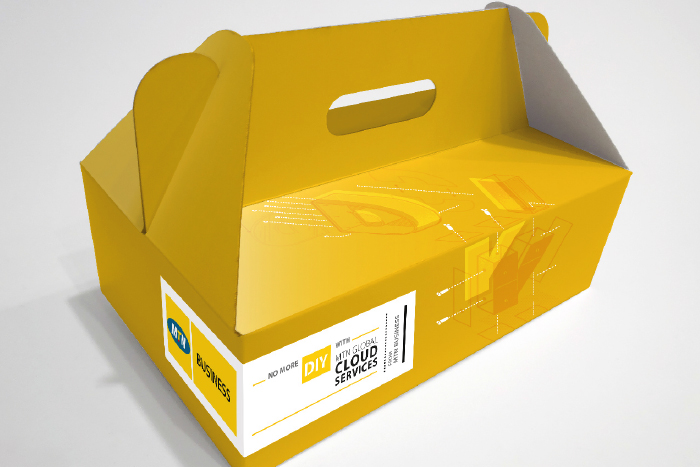
We created standards and marketing kits for the teams at MTN to enable them to manage the Brand consistently, and develop standards so that an ad in Yemen always looked the same as an ad in Nigeria or anywhere else the company operates. That formed the basis of an overall plan. This included looking at MTN’s overarching Corporate Identity (CI), which was refined, taking into account the fact that it couldn’t be changed radically. All of this work was then incorporated into a Brand CI manual. The stores were also redesigned in line with the Brand positioning and retail strategy. The solution had to be scalable and take into account that there might be a superstore in a city like Johannesburg or Cape Town, and a smaller store in a mall in a small town.
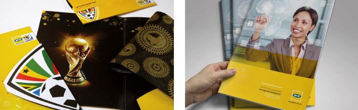
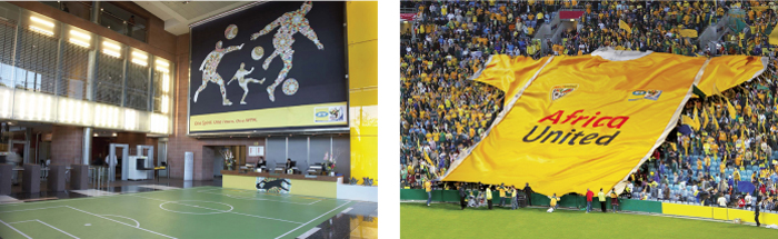
The next solution had to address the 2010 FIFA World CupTM sponsorship. We developed and launched a campaign aimed at the MTN ‘Family’. Some countries where MTN operates are outside Africa and the campaign needed to garner the support of all staff for what MTN was doing for the World Cup. Various aspects had to be covered. This included activating MTN Hospitality for clients and addressing marketing opportunities in all markets where it does business. In Johannesburg, the company took over key hotels to accommodate important clients and put up huge activation areas for the public at OR Tambo airport and other public places. It also made the MTN Head Office entrance look like that of a stadium.


The Solution
MTN managed to own the environment and the energy of the World Cup. It was a great coincidence that one of Bafana Bafana’s colours just happened to be yellow. We created a ‘club’ inside MTN called Africa United, featuring flags of the countries where MTN does business. This concept was taken further using players from various African teams who were sponsored by MTN.
There is consistency of application of the Brand. Stores already look more professional and more synchronised with the re-designed Branding material. The 2010 FIFA World CupTM sponsorship created huge awareness for the MTN Brand and managed to lift the Brand to the same level as that of the World Cup brand. MTN really felt like a global Brand. Naturally, MTN will need to ascertain the impact of the World Cup on its Brand and ensure that the value of this Brand association is defined. MTN will also have to determine how this value will be leveraged to gain additional value in future.